In The Stones of Venice Ruskin wrote about three types of designers (with a focus on decorative arts). The first type favors realism above all else and will sacrifice design and composition in favor of a realistic depiction of their object. The second lies on the opposite side and favors design and composition. They will abstract and bend the object to an extent deemed necessary for it to function properly as part of the overall piece rather than respect the laws of nature that would lead to a more realistic portrayal of that object. The third type lies between the first two and respects both realism and design, able to fashion work that is neither abstracted beyond recognition, nor bound by the rigid rules of realism.
Let me show you now an example of each so you can see for yourself how they differ, and more important, how the third is able to strike the balance between realism and design. I’m going to take wallpaper designs for this example from a typical retailer – John Lewis in this case, which fortunately also carries one of the best examples of the third type.
Here is an example of the realistic type:
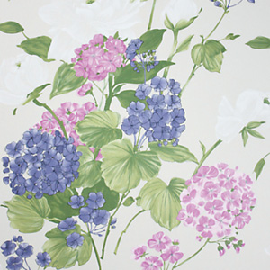
Osborne & Little Penrose Wallpaper
You can see that the flowers are depicted as they are in nature, so that what we have is more of an illustration than a wallpaper pattern. The composition is three dimensional as leaves and flowers are placed both in the foreground and in the background, again, as you would expect a real bunch of flowers to look like. There is color, shading, and plenty of little details added to make up the texture of the leaves.
Now let’s take a look at the opposite, the abstracted type:

John Lewis Johnston Damask Wallpaper
You can see that realism here is sacrificed for the sake of achieving an even texture. Where the realistic type leaves a lot of blank space around the object, this one does well to fill all of it up to ensure more or less a uniform texture throughout. This particular example is pretty good in that the leaves and flowers still do resemble the real thing. Many times such designs would utilize shapes that are merely floral looking, random leaf shaped swirls. The idea with this type is to create a uniform pattern from its object to be placed a two dimensional plane, which is achieved at the loss of realism.
The third type is the most interesting though as it manages to weave together the best of both:
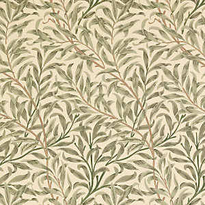
Sanderson Wallpaper, William Morris Willow Boughs
This is a modern printing of the work of the famous nineteenth century designer William Morris, the father of the arts and crafts movement in Britain. Here Morris depicts the branches and leaves with a strong sense of realism, but at the same time flattens the composition onto a two dimensional plane and lays out the object so that all of the space is filled up evenly and there are no large gaps or concentrations of color. On close inspection the leaves look real, flowing and bending and swaying in the wind, but due to the careful composition the wallpaper manages to create an even, seamless texture, well suited for use on a flat wall.
Notice also how color is affected. The abstracted design reduces color and shading to a minimum, while the realistic one preserves it. The central one retains some color but keeps it limited to ensure the composition maintains an even texture and shading when viewed from a distance, a quality a wallpaper should have.
The drawbacks of the realistic approach are that it has gaps and concentrations of color which lead to an uneven texture across the wall, and that it depicts the object in three dimensions, which clashes with the two dimensional plane of the wall. To solve this the abstraction designer flattens the composition and fits bits and pieces of the object close together. This however introduces the drawback of destroying the real intricacies and details in the object, at times even reducing it to a primitive shape.
The central designer also works to flatten the composition, but the difference here is that they cannot bring themselves to degrade the object to a mere abstract pattern. They depict the object as well as they can and use all their skill to bend it into a form suited for the decoration of their product. The result is truly beautiful as the work manages to strike the most difficult balance between realism and design.