William Morris, the grandfather of the arts and crafts movement in Britain in the nineteenth century, had expressed his views on how books should be typeset in his essay on printing (Gutenberg copy). The essay deals in part with the design of typefaces, and I found his critique of modern typefaces especially interesting, sensing a parallel between his views and those of John Ruskin on the evolution of architectural ornament in Venice.
Morris had his own printing house, the Kelmscott Press, which produced books with his distinctive ornamental style, typeset using the the three fonts he designed himself. If you’re not familiar with his work, here is an example page from Kelmscott Chaucer. I own a facsimile edition of this book from Folio Society and it undoubtedly one of the best crafted books I’ve ever owned or seen, with the only flaw being a lack of color (the only two are black and red). The originals decorations and illustrations were printed using woodcuts, so there was a limit in what could be done.
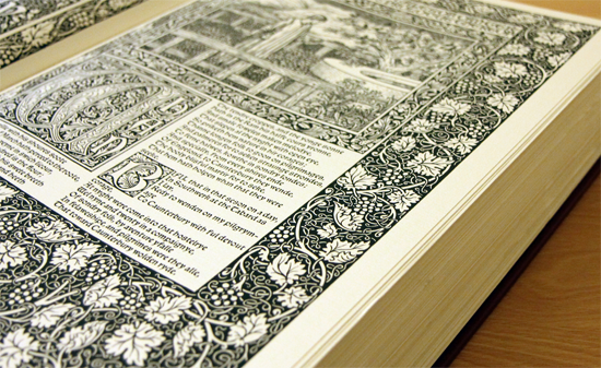
Morris was undoubtedly one of the best publishers of his age, and today, as most modern books become ever cheaper in their design and make, his attention to detail and style make his work stand out even more. In printing he favored the traditional approach, leaning towards heavier Gothic typefaces, set tightly together to produce thick blocks of text. This style of printing works well for poetry such as that of Chaucer, which reflects the Medieval period and style of the original writing. More modern works required a slightly different style, and so he also created a Roman typeface he called Golden Type, which was modeled on the early Venetian humanist typefaces.
Morris had a distaste for modern typefaces like that of Bodoni and Baskerville, disliking the heavy contrast between the thick and thin strokes. Additionally, he hated the way the descenders and terminals ended on some fonts with a curve and a bloated dot, rather than a straighter, leaner edge. His view of a perfect Roman font was something along the lines of the old Venetian typefaces of Nicolas Jenson – wide letters, simple edges, and retaining a fairly even stroke width throughout.
The style Morris uses is fairly distinctive and leans towards the black Medieval blackletter typography, less suited for modern content, but nevertheless, whenever I have to pick a body font I keep thinking about his suggestions. I think there’s more than just an aesthetic element here, but a cultural one, or even a moral one as well, if such a thing can be said about a typeface.
Here’s an example of some of the things he talks about – the exaggerated curves, bloated terminals and descenders and stark variations in stroke width. Below is a picture of letters ‘a’, ‘c’, ‘e’, ‘j’ and ‘y’ set in LTC Bodoni 175. I have highlighted some of the “offending” areas:
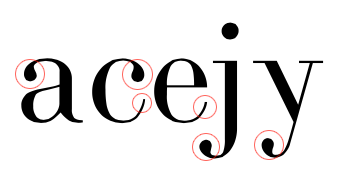
Observe how the top of the letters ‘a’ and ‘c’ end with a dot, like a droplet of ink. The same thing also in the descenders of ‘j’ and ‘y’, making those ends needlessly bloated. Notice how the bottom of the letters ‘c’ and ‘e’ end with an upward curve. The curve could have been terminated at the bottom, but it is exaggerated upwards. Finally, we have the powerful contrast between vertical and horizontal strokes, the vertical being thick and strong, while the horizontals as thin as a hair.
Now, I am not saying Bodoni is a bad font, merely pointing out some of the stylistic elements that Morris did not approve of. I find sense in his critique so when I was picking a font for this very blog I actually spent some time examining the smaller details on various typefaces to see if I could find one that satisfied all, or most, of the criteria. I’m currently very happy with a font called Elena from Process Type Foundry. Here is a picture of the same letters used for the Bodoni example above to show you the stylistic difference:
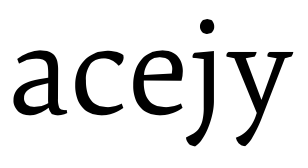
It is an overall leaner and more human font. The strokes are not as straight and precise as in Bodoni, and the variance in thickness is only very slight. Descenders get to the bottom and terminate quickly, with no additional curves or dots, as if drawn with a single, confident stroke. Same thing with the lower curve on the letters ‘c’ and ‘e’ ending at the bottom just when its function is satisfied, not continued upwards as in Bodoni and other such fonts. Where Bodoni tries to show a level of sophistication through exaggerated style, Elena is simpler and more severe, yet also with its own sense of grace that makes it a pleasure to look at and read.
The dislike for the exaggerated style in the design of letters echoes the words of John Ruskin, the most famous art critic of the nineteenth century whose views played a large part in Morris’ own approach to art. Ruskin didn’t write about typeface design, he wrote about architecture, but there is a similarity here with Ruskin’s description of how Gothic leaf ornament underwent degeneration during the Renaissance by becoming over-ornate and bloated.
Please excuse the quality of the images here, though lacking detail they should suffice to give a general idea of the transition in style. Below are examples of Byzantine leaf ornament used on column capitals in Venice:

This is the earliest period Ruskin examines. You can see how the style is very abstract, favoring composition and design over realism. During the Gothic period that followed, the Byzantine style evolved into something more realistic that broke away from the symmetrical composition. The Gothic leaves are fresh, lean, and alive, well composed for their function but also showing a good level of realism.
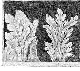
The final evolution of the column capitals occurs during the Renaissance. Here, the realistic leaves from the Gothic period are given an extra stylistic treatment. Additional curves are introduced, existing ones are exaggerated and at the tips we see the leaves curling into balls.
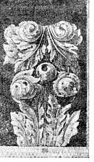
The Gothic craftsman was not satisfied with the abstract, symmetrical look of Byzantine ornament. He broke the symmetry and introduced an element of realism. The leaves curved, but they were kept restrained, lest the style go over the top. The Renaissance craftsman in turn became bored with the Gothic and began to push for more style. His love of curves took over and the leaves began to curl into balls. The leaf that was once lean and strong is now a mass of curves, flamboyant and bloated. It exhibits luxuriance and style but loses its vitality in the process.
If you replace the descender of a letter for the leaf, you have much the same critique in what Morris had to say about typeface design as Ruskin did about the degeneration of Gothic ornament during the Renaissance. The lean stroke shows strength and vitality. The curved one ending in a ball exhibits flamboyance and pomp. Renaissance ornament is beautiful in its own way, but the excessive style also starves the life out of the realistic and natural form that it is based on.
Ruskin did not hesitate to draw moral conclusions, liking the state of ornament to the state of society at the time. It is possible the same can be done with the typeface, though I will not try to push that far in this post. What I will say is that the typefaces we use all convey a certain character. Their style and construction convey the underlying feeling of their designer, whether or not it was exercised consciously during the creation of the typeface, and this in turn this feeling permeates the words that you set in that typeface by the myriad of tiny details through which it is realized.